Client project (class) · DTC 497 · 2026
Whitman County Landlord Association
Click “Current Issues” on the old site and you land on an empty page.
A semester-long redesign for a county nonprofit: nine flat pages became five clear paths for landlords, tenants and members.
- My role
- UX designer and project manager
- Timeline
- Spring 2026, one semester
- Team
- 7 students, split into a design track and a writing track
- Tools
- Figma, Adobe Express, Milanote
01 · Setting the scene
One website, two very different visitors
The Whitman County Landlord Association (WCLA) is a nonprofit that supports landlords, property owners and tenants in Whitman County through education, resources, advocacy and networking. Its website serves two audiences: landlords looking for legal updates, events and membership, and tenants looking for their rights and moving-in guidance.
Our brief was a full website redesign for my DTC 497 course. Over the Spring 2026 semester, a team of seven students worked directly with the association's stakeholder, split into a design track and a writing track. I was the UX designer and project manager, and I owned:
- The mood board and style guide that set the visual direction
- The stakeholder question set and client discovery
- Card sorting and A/B testing of the navigation (co-led)
- The Home, Laws & Resources, Tenants, Log in and Sign up pages
- A logo redesign proposal, and the pivot when the client declined it
- Keeping the writing and design tracks building the same structure
The constraint: one semester, seven students, and a client who had to keep running the association the whole time.
02 · The problem
The resources were there. Nobody could find them.
An audit of the existing site and conversations with the client turned up problems that kept visitors from reaching the very resources the association exists to provide.
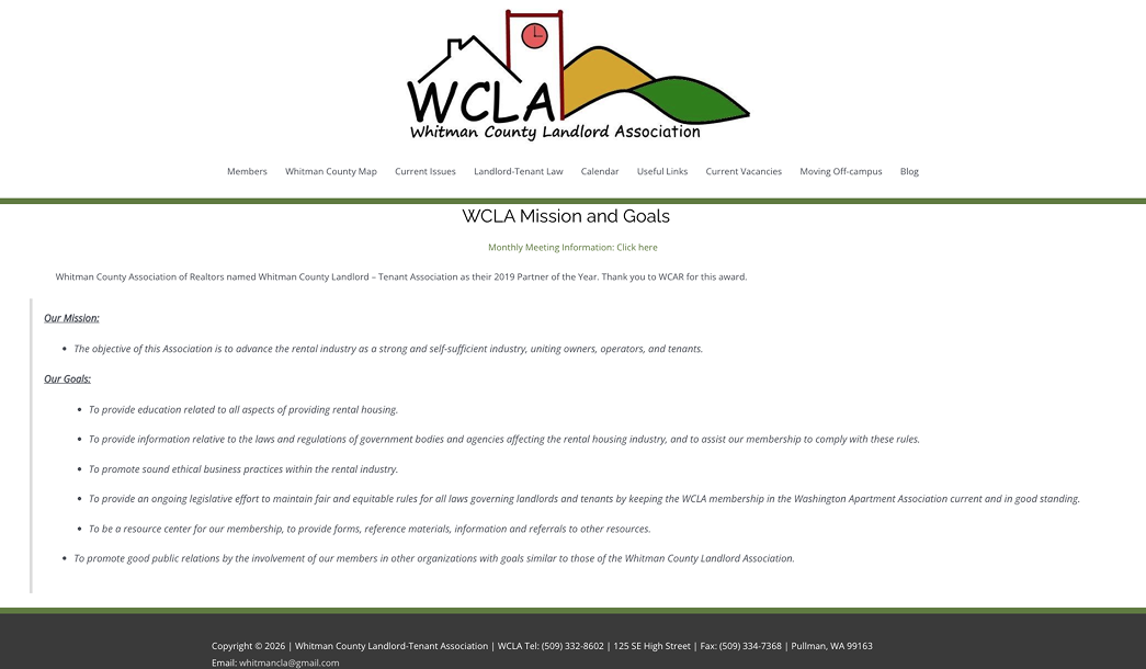
Dead ends. Several navigation items led to pages with little or nothing on them. Clicking "Current Issues" or "Blog" landed you on an empty template with a sidebar and nothing else. Once a site fails you twice, you stop looking and pick up the phone.
A flat structure. Nine top-level items, with no grouping and no hierarchy. Visitors had to interpret where something might live instead of recognizing where it was, and they paid that cost on every visit.
Hard to scan. Small amounts of information were spread across large empty areas, so related resources felt disconnected. Where content did exist, it came as long, undifferentiated lists of text links, which are impossible to scan when you're looking for one thing.

The goal: simplify the navigation, improve accessibility, modernize the visual identity, and reorganize the content around what visitors need.
03 · Digging in
Asking the people who'd actually use it
Learning from stronger sites
We studied NARPM and the Rental Housing Association of Washington, and turned each finding into a decision for WCLA:
- Strong sites lead with what visitors can do. We moved the mission statement to About and opened the homepage with actions.
- They make member benefits impossible to miss. We built a dedicated membership path with a visible sign-up entry.
- They describe events, not just date them. We redesigned events as scannable cards with a line of context each.
- They let layout carry the reading order. We adopted a column structure with clearer spacing and grouping.
Listening to the client
I wrote the stakeholder question set and led discovery into the organization's goals, its members' needs and its long-term plans for the site. Three themes came out of it:
- The organization wanted simpler membership registration, log in and sign up visible on the homepage, and its existing logo kept, with a refreshed palette.
- Members and tenants needed separate resources for each audience, FAQs for both, and a members-only space for legislative updates.
- The content needed pruning: outdated and unused pages removed, and a membership page with registration and bylaws added.
Discovery also gave us an early scope call. The site had a broken county map, and it turned out it had never served a purpose and members weren't looking for it. Instead of spending the semester rebuilding a feature nobody used, we removed it and put that time into the membership flow.
Letting users sort it out
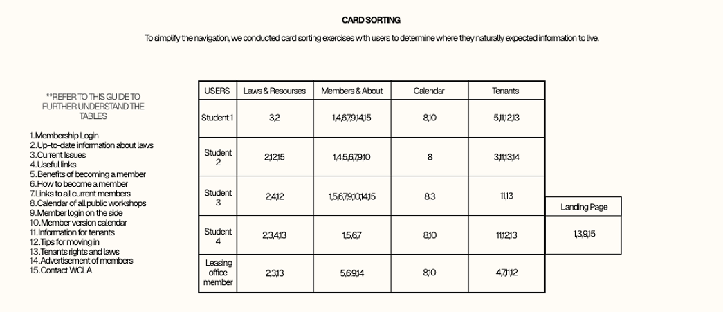
Five participants (four students and one leasing office manager) sorted fifteen pieces of site content into the categories where they'd expect to find each one. The sort produced two workable groupings rather than one clear winner, so we built low-fidelity versions of both and tested them head to head. Participants attempted real tasks instead of telling us which layout they preferred, and we ranked the structures by task success and what they said along the way.
One teammate took the test to a local leasing office, so we'd hear from someone who uses sites like this for a living. The property manager and the students looked for the same information in different places, and hers was the mental model the site actually had to serve.
04 · The turning point
Log in isn't content. It's an action.
Membership login was the one card nobody could place. Every participant either pushed it to the landing page or attached it to whatever category they happened to be looking at. It had no natural home because it isn't content. It's something you do.
So we stopped treating it as content. Log in and sign up became persistent buttons in the header and a repeated call to action on the homepage, never a navigation item. That one finding shaped the homepage more than anything else we tested.
A second finding backed up the client's instinct: every participant, unprompted, separated tenant content from landlord content. That confirmed splitting resources into two audience paths instead of one combined library.
Nine top-level pages became five, organized around what people expected to find rather than how the organization is structured internally:
| Section | What lives there |
|---|---|
| Home | Mini calendar, latest news, sign-up prompt |
| Laws & Resources | Current law information, current issues, useful links |
| Calendar | Public workshops, member-only calendar |
| Tenants | New-tenant info, moving-in tips, tenant rights and laws, member listings |
| About | Membership benefits, how to join, current members |
| Footer | Contact and landlord logos |

05 · Making it real
Designing around what people do
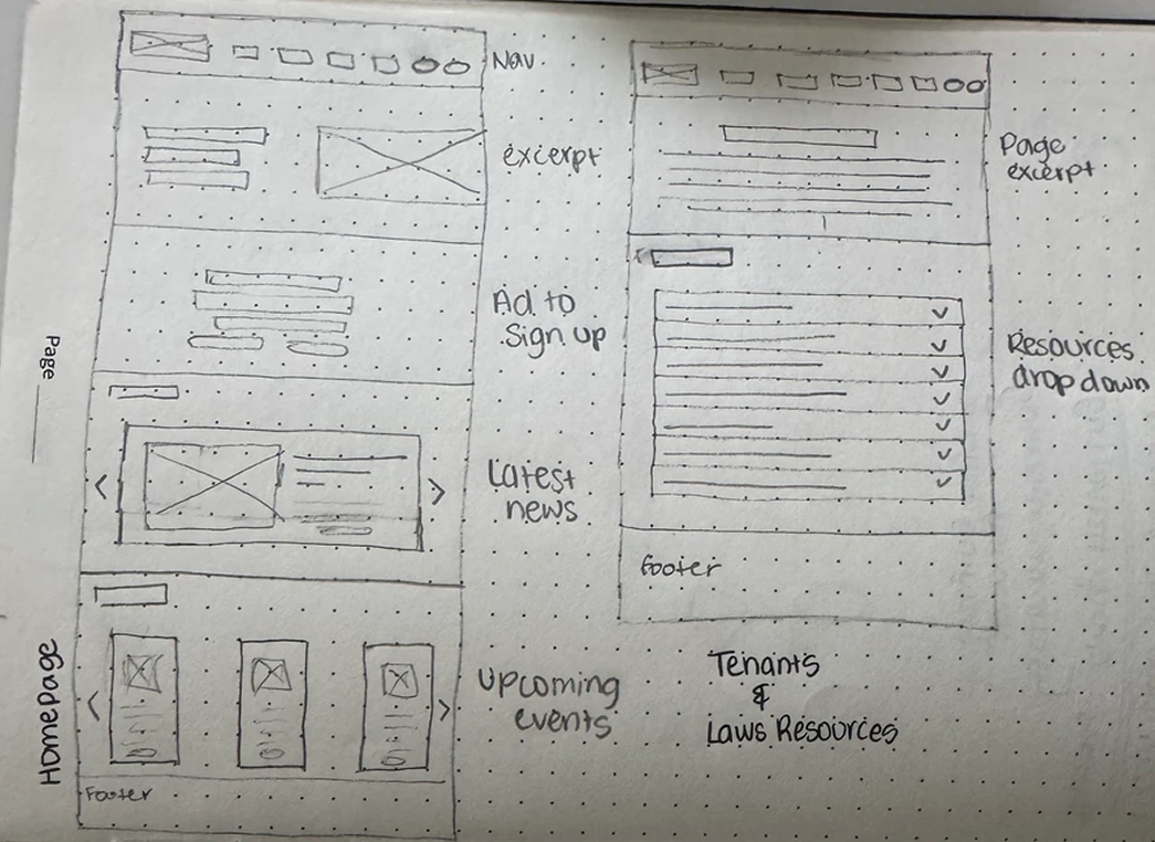
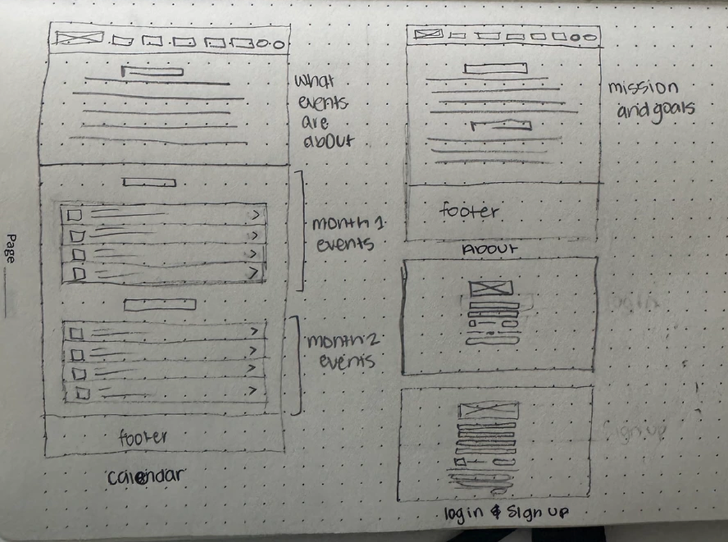
I sketched low-fidelity wireframes on paper first to test layouts and prioritize information before committing anything to Figma, checking each against what we'd heard from the stakeholder.
Actions live in the header, not the nav
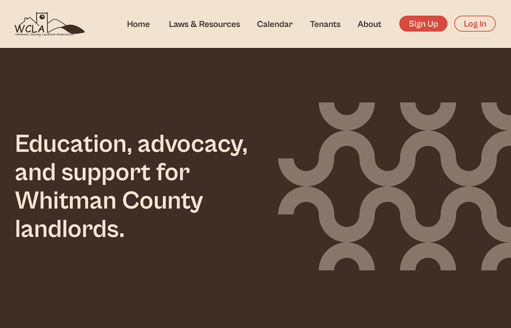
Straight out of the card sort: log in and sign up sit in the header and repeat midway down the homepage. News and upcoming events, which used to be reachable only through the calendar, now sit on the first screen, because they're the two things members come back for. The mission statement that used to open the homepage moved to About, so the homepage now opens with what a visitor can do.
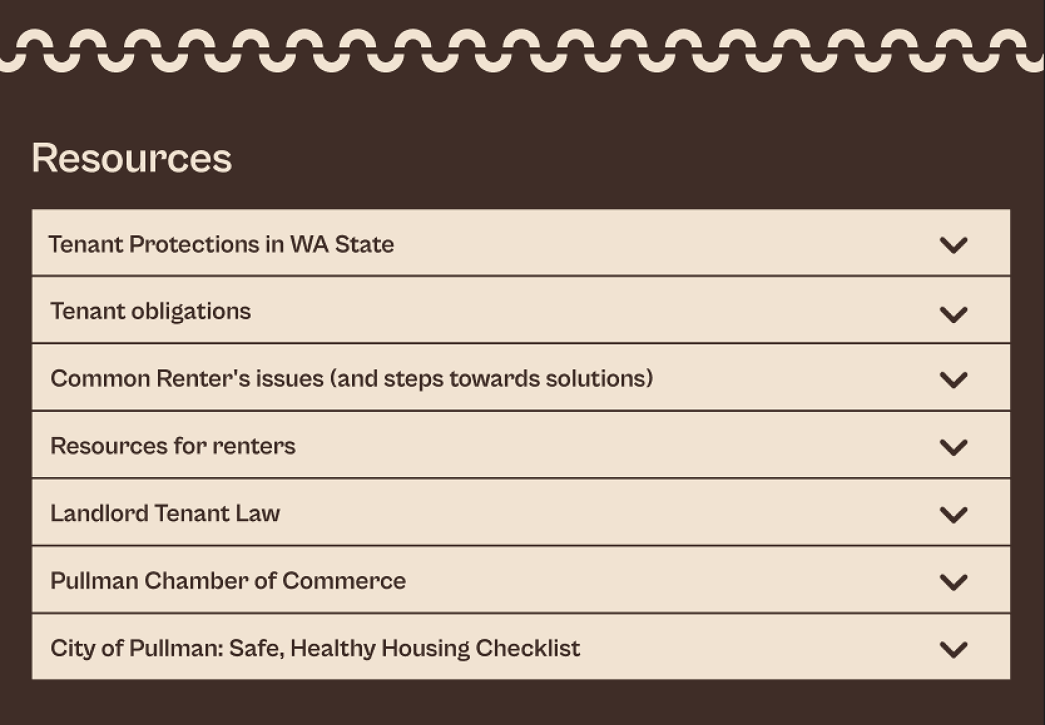
Accordions instead of link lists
This solved the scannability problem structurally. A page of resources now fits on one screen and expands on demand. Landlord and tenant content got separate paths, the split every participant made on their own. FAQs now live on the page itself, where the old site used to send people off to external legal sites and lose them.
Membership earns its own screen
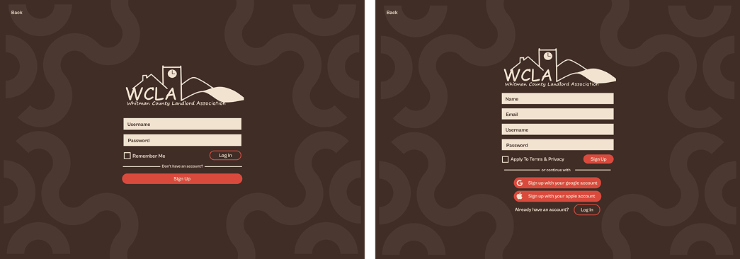
Membership is the association's revenue and its reason to exist, so log in and sign up are dedicated pages, not a pop-up. Sign up is the filled, primary button, because the site has far more prospective members than returning ones. Social sign-in is on by default: the membership skews older and isn't uniformly technical, and taking the password out of the path removes the most common place people give up.
One system across every page
One palette, one type scale, one accordion pattern and one wave motif carry across Home, Laws & Resources, Tenants, About and Calendar. A visitor moving between resources, events and membership never has to relearn the interface.
The logo I wanted to change
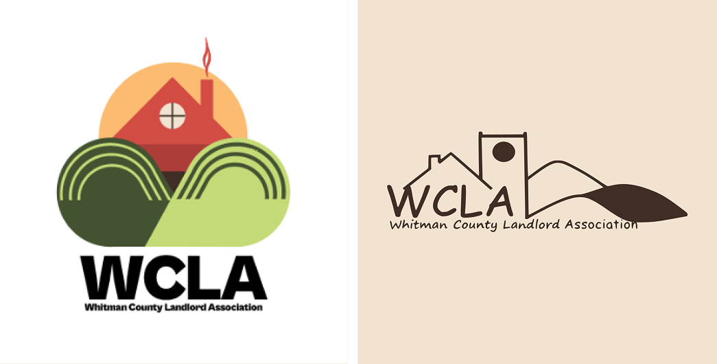
I sketched several alternatives to the existing mark. My argument was that the clock tower is an outlier: it has nothing to do with a landlord association, while the house and the rolling Palouse hills do. I still think that was a fair critique of the logo as a piece of design.
The client wanted to keep it. The mark carries a decade of recognition with members who have known it for years. My critique was about the design; their answer was about their members, and theirs was the more important question.
So we kept the logo and built everything around it. The deep brown, sand and terracotta palette exists because that conversation went the way it did.
06 · The ending
Five paths, and a lesson about who a design is for
At the end of the semester, we handed the association a high-fidelity Figma prototype covering Home, Laws & Resources, Tenants, About, Calendar, Log in and Sign up, all built on a shared visual system and ready for whoever builds the site.
If it shipped, I'd measure
- How long it takes to find a specific resource
- Membership sign-ups started vs. completed
- Bounce rate on the consolidated pages, to make sure merging didn't bury anything
What I'd do differently
- Test the high-fidelity screens. We validated the structure but never put the finished designs in front of users, so every decision after A/B testing rests on judgment, not evidence.
- Recruit earlier and wider. Four of five card sort participants were students. The leasing office manager gave us our most useful signal, and we found her late.
- Agree on success measures up front. We never defined with the client how we'd know the redesign worked.
- Plan the handoff from day one. Once we sent the prototype, the conversation ended there. Next time I'd agree early on who builds the site, when we'd check in after delivery, and how we'd hear feedback.
What it taught me
- Design decisions land differently when a real organization has to live with them. The logo I wanted to redesign carried recognition I hadn't accounted for.
- On a seven-person team, much of the design job is translation: keeping the writing track and the design track building the same structure.