Student design agency · 2026
Club Studio
Real clients, real deadlines, and a brief that can change overnight.
At WSU's student-run design agency, I grew from graphic designer to web designer to project manager, working on real client briefs.
- My role
- Graphic designer → Web designer → Web design project manager
- Timeline
- Spring 2025 – May 2026
- Team
- Logo: 1 other designer, Website: Club Studio web team
- Tools
- Adobe Photoshop, Cargo
01 · Setting the scene
A real agency, run by students
Club Studio is a student-run creative design agency at Washington State University. Students partner with real clients to deliver branding, UX/UI, web and marketing work, and get hands-on professional experience along the way.
Over a little more than a year, I held three roles there:
- Graphic design intern (Spring 2025)
- Web designer (from August 2025)
- Web design project manager (January – May 2026)
Each role asked something different of me: first to make things, then to improve them, and finally to help a team deliver them. This case study follows two projects from that journey: a logo for a conservation nonprofit, and a redesign of Club Studio's own website.
02 · The problem
Two clients, two very different asks
Palouse Prairie Foundation is a nonprofit in Moscow, Idaho, dedicated to preserving and restoring the endangered native Palouse Prairie ecosystem in Latah and Whitman Counties. Early in its branding project, it asked us for a new logo that could carry that mission.
Club Studio itself had a website that looked designed but didn't work for the people using it. Visitors couldn't move around the site without struggling, which undercut an agency whose whole pitch is good design. That's what prompted the redesign.
03 · Digging in
Starting from the mission
For the foundation, my teammate and I looked at how other nonprofits present themselves, and dug into the foundation's own mission. We wanted a mark that would resonate with the people who care for the prairie, not one that could belong to any organization.
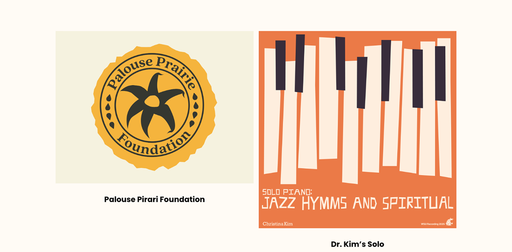
That led us to the arrowleaf balsamroot, a native flower that has come to symbolize the Palouse Prairie. It gave the mark something specific to this place, not a generic leaf or landscape.
04 · The turning point
When the scope changes after you deliver
We designed and delivered the logo. Then the foundation decided the redesign was no longer part of its project scope, and the logo was set aside.
It wasn't a verdict on the work. Priorities shifted, which happens with real clients. But it taught me that a design only matters if it fits what the client needs right now, and that scope is something to confirm early and keep confirming.
That lesson shaped my next role. On the Club Studio website, the job wasn't to invent something new. It was to make what already existed easier to use.
Design isn't always about creating something new. Often it's about improving what already exists.
05 · Making it real
From emblem to interface to team
A vintage emblem rooted in the prairie
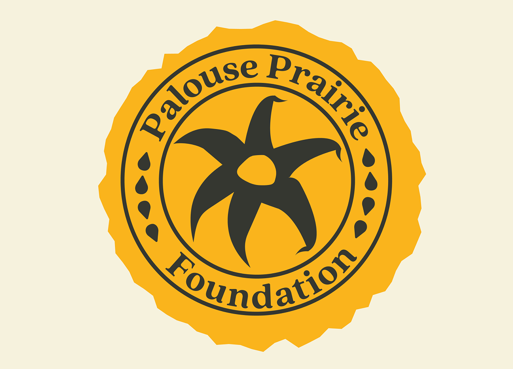
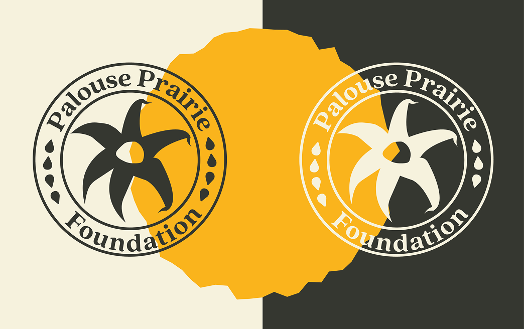
We designed a vintage-inspired circular emblem centered on the balsamroot, simplified into a bold, sun-like silhouette so it would stay recognizable at any size and feel timeless rather than trendy. The circular badge stands for unity, continuity and the prairie's natural rhythms. A neutral palette keeps the identity classic and understated, while a warm golden accent adds emphasis and quietly references the prairie landscape.
A Work section you can actually browse
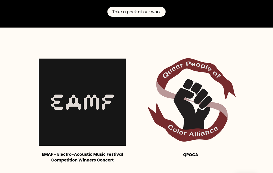
Rebuilding the site in Cargo, I kept the agency's existing brand and focused on navigation and accessibility. My main contribution was making the Work section fully scrollable, so visitors can move through all of the agency's projects in one continuous flow instead of struggling to find their way around.
A Contact page that gets to the point
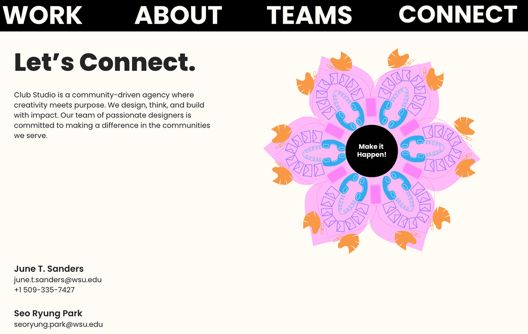
I reworked the Contact page so key information is easy to find. The new layout gives it a clearer visual hierarchy while staying consistent with the agency's branding.
Leading the web team
The website redesign ran across both of my later roles. When I became web design project manager in January 2026, I took on running the team's meetings, assigning tasks and communicating with clients, so the designers could focus on the work and clients always knew where things stood.
06 · The ending
Growing as a designer and a teammate
Club Studio showed me what it's like to work in a collaborative design agency with real clients. I strengthened my skills in branding, web design, accessibility and project management, and learned to communicate ideas, adapt when a project's scope changes, and work inside an established design system.
What I learned
- Improving is design too. Refining an existing interface takes as much care as starting fresh.
- Confirm scope early, and keep confirming. Even finished work can be set aside when a client's priorities move.
- Leading is part of the craft. Running meetings, dividing work and keeping clients informed is what gets good design delivered.
- Teams make the work. Collaborating across disciplines, and balancing user needs with client needs, gave me confidence I couldn't have built alone.
Looking back, Club Studio helped me grow not only as a designer but also as a teammate, and made me even more excited to pursue a career in UX and product design.