Internship · 2026
Blood Orange Review
Every story arrives in its own shape. The page has to honor it.
As a web design intern, I published 15–20 pieces of issue 18.1 in WordPress and proposed a CSS fix that made fiction formatting consistent.
- My role
- Web design intern
- Timeline
- October 2025 – May 2026
- Team
- BOR Web Team
- Tools
- WordPress, CSS
01 · Setting the scene
A journal for voices that don't often get the page
Blood Orange Review is a literary journal dedicated to giving emerging and established writers an inclusive platform, and to championing bold, innovative work by historically and aesthetically underrepresented voices.
From October 2025 to May 2026, I was the journal's web design intern, working with the person who manages its website on issue 18.1. This wasn't a design-from-scratch project. My job was to take accepted work and bring it online in WordPress, so each piece reached readers the way its author and the editors intended.
02 · The problem
Every submission arrives different
Issue 18.1 brought together poetry, fiction, nonfiction and more, and every piece arrived formatted however its author wrote it. The journal, though, needs to read as one publication. If spacing, titles, bylines or paragraphs shift from page to page, readers notice, and the work itself starts to feel less cared for.
For a journal that exists to elevate voices, presentation is part of the respect.
03 · Digging in
Learning the house style
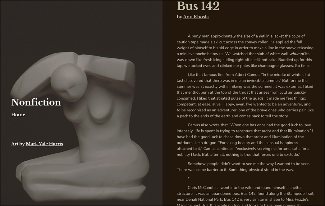
Before publishing anything, I learned the journal's editorial standards: how titles, author names and bios are set, and how each kind of work should sit on the page. Then I applied them, one piece at a time, uploading each work to WordPress and formatting it to match.
04 · The turning point
Fixing the pattern, not each page
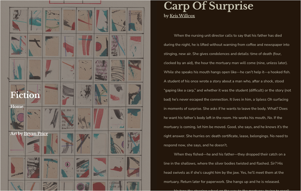
Many of the fiction pieces needed their paragraphs indented, the way they'd appear in print. WordPress doesn't do that by default, and fixing it by hand on every page would have been slow and easy to get slightly wrong each time.
So I proposed a small CSS block that indents paragraphs wherever a piece calls for it. The website manager approved it, and it became the standard across every piece in the issue that needed it. One fix, applied the same way everywhere, instead of a dozen hand-made ones.
05 · Making it real
Publishing issue 18.1, piece by piece
Formatting every work
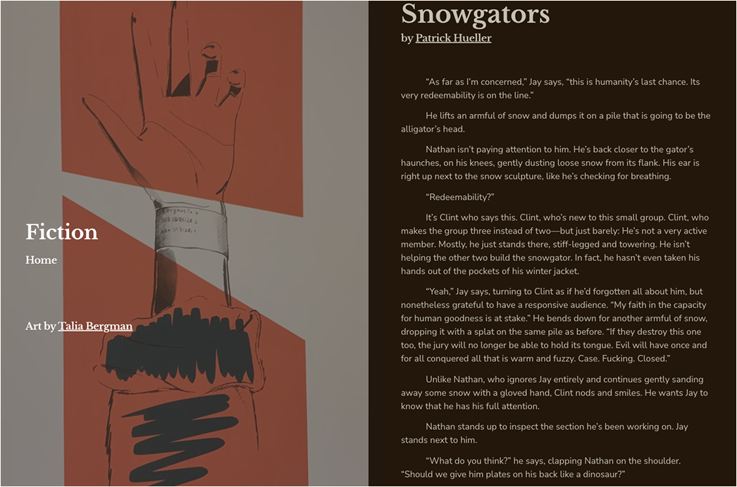
I published around 15 to 20 pieces, formatting titles, bylines and body text to the journal's standards so a reader moving from a poem to an essay to a story never has to adjust to a new layout.
Checking consistency across the issue
I compared pages against each other, not just within a single piece, so spacing, type and structure matched across the whole issue.
Preparing it for readers
I organized each piece and prepared it for publication, so the issue was ready to go live.
06 · The ending
A seamless reading experience
Issue 18.1 went live with every piece I published formatted to one standard, and the indent fix is now part of how the journal handles fiction. The feedback from the team was positive: they liked the care I was bringing to the work.
What I learned
- Detail is the work. Publishing for a journal sharpened my eye for spacing, hierarchy and the small inconsistencies that break a reading experience.
- Fix the system, not the symptom. When the same problem shows up on every page, a reusable rule beats hand-fixing each one.
- WordPress in a professional setting. I became much more confident in a real content management system on a real publishing schedule.
- Content management is design too. Consistent formatting and organization are what make a site feel seamless to read, even when nobody notices them.