Client project · 2026
ClanAway
Birds never migrate alone.
A logo and visual identity for a collaborative, AI-powered travel planner, built around birds that migrate together.
- My role
- Graphic designer
- Timeline
- July 2026
- Team
- Solo
- Tools
- Adobe Illustrator
01 · Setting the scene
Planning a trip, together
ClanAway is an AI-powered travel planning platform. It builds personalized itineraries around each traveler's preferences, interests and schedule, and lets friends, family or travel companions plan, talk and decide together in one shared space.
In July 2026, ClanAway's team brought me on to design its logo and visual identity.
02 · The problem
A travel brand that's about people, not places
Most travel logos reach for the same symbols: planes, pins, globes. They say "travel," but ClanAway's difference is who you travel with. The brief was to design a logo that shows collaboration, connection and travel at once, and to set up a visual identity that carries the brand's mission.
03 · Digging in
Looking for a symbol of moving together
I started wide: hours of browsing Behance to see how other brands handled travel and togetherness, and some research into word associations, mapping what people connect with "travel" and with "group."
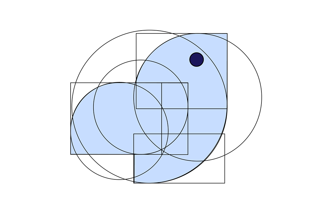
The chain of associations is what cracked it. Travel almost always means planes. Planes were designed with inspiration from birds. And birds migrate in groups.
04 · The turning point
Birds that migrate as one
That last link was the idea I was looking for. Birds migrate together. They take turns leading, support each other over long distances, and arrive as a group. That was ClanAway's whole idea: teamwork, shared experiences and journeys taken together, with everyone helping each other make something unique along the way.
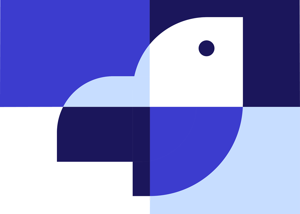
The flock became the mark.
05 · Making it real
Building the identity around the flock
Blues for trust and exploration
I built a modern, approachable palette from deep and vivid blues:
- Deep navy (#1B165B) brings credibility and reliability
- Vivid blue (#3C3CCE) carries trust and a sense of exploration
- Sky (#C7DDFF) feels open, like the travel itself
- White gives the system balance and clarity
Together they form one cohesive system that reflects ClanAway's goal of making travel planning intuitive, collaborative and enjoyable. The key pairings are also accessible: deep navy on white has a 16:1 contrast ratio, and vivid blue on white reaches 7.7:1, both well above the standard for readable text.
A wordmark that lets the mark lead
For the ClanAway wordmark I chose Switzer Variable. Its simple geometric structure complements the bird mark without competing with it, and it's modern yet approachable, matching the brand's promise that travel planning should feel intuitive and accessible.
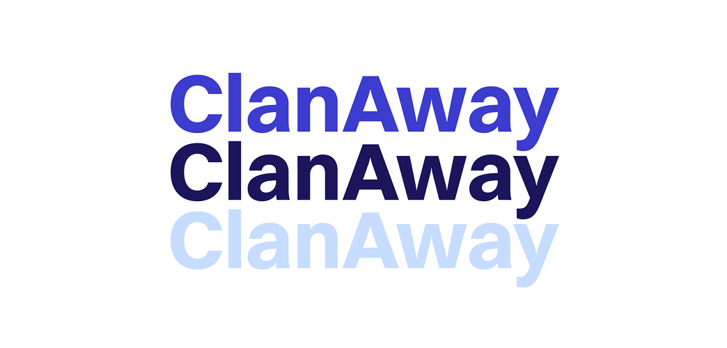
One logo, light and dark
I designed light and dark mode versions so the brand stays recognizable, functional and accessible across digital platforms and user preferences.
Try it out: switch the logo between light and dark mode below.


06 · The ending
Branding is about meaning
The final identity includes the logo mark, the wordmark, a four-color palette, and light and dark mode versions, all built from one idea.
What I learned
- Meaning comes before visuals. Every element, from the flock to the blues to the typeface, had to support ClanAway's mission.
- Symbolism needs intention. I had to think critically about what each choice says, how people would perceive it, and how it holds up across uses.
- Consistency makes it a brand. A logo becomes an identity when every piece works as one system.
This project let me show that I can build brand identities that are strategically driven and visually appealing.