Class project · DTC 497 · 2025
Keep Em' Swimmin'
Most environmental campaigns try to scare you. This one wanted you to root for the salmon.
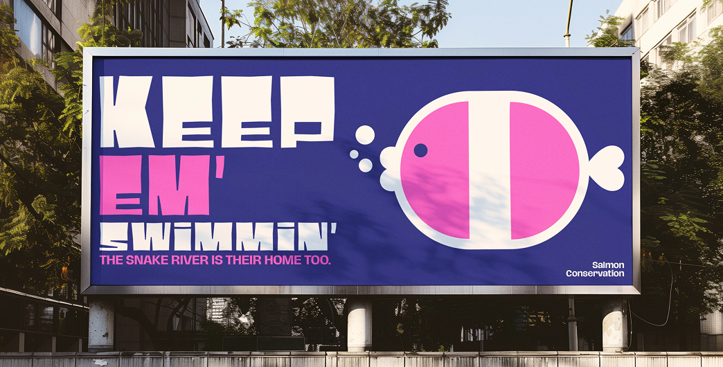
An environmental awareness campaign that uses playful illustration and bright color to show why salmon matter to the Palouse.
- My role
- Graphic designer
- Timeline
- Fall 2025, 4 months
- Team
- 4 designers
- Tools
- Adobe Illustrator, Adobe Photoshop
01 · Setting the scene
Why salmon matter to the Palouse
Salmon connect the Palouse's rivers to the forests, wildlife and communities around them, but most people never think about that link. Keep Em' Swimmin' is a campaign that uses digital storytelling and visual design to help audiences see it.
It was a fictional campaign created by a team of four in my DTC 497 course over four months in Fall 2025 at Washington State University. We shared one strategy, then each designed our own take on it. I was a graphic designer, and every piece shown here is my own.
02 · The problem
A story usually told with fear
The facts about salmon in the Snake River and the wider Pacific Northwest are hard to hear. Roads and wetland filling have destroyed habitat. Straightened rivers and disconnected side channels leave streams less resilient to floods and drought. Dams, overharvest and hatchery fish poorly adapted to the wild have all weakened wild runs, and salmon are now listed under Washington's endangered species protections.
Environmental campaigns usually lead with exactly these facts. They get attention, but they can also leave people feeling helpless, and helpless people tune out. Our challenge was to raise awareness in a way that felt encouraging, not discouraging.
03 · Digging in
What salmon give
So we researched what salmon give, not only what's being lost.
- They feed whole landscapes. Salmon runs carry ocean nutrients into rivers that would otherwise be poor in them. Bears and other predators that eat salmon spread those nutrients into the forest, helping trees grow that shade streams and hold back erosion.
- They sustain livelihoods. Pacific salmon fuel a $3 billion industry that supports jobs and economies along the Pacific Rim.
- They hold deep cultural meaning. For the Nez Perce, Palouse, Yakama and other Columbia Basin tribes, salmon are central to ceremonies, traditions and the passing of knowledge between generations. A teammate's research into Northwest Coast traditions showed salmon as symbols of resilience, selflessness and renewal. The First Salmon Ceremony, which welcomes the season's first fish and returns its bones to the water, was revived among Puget Sound tribes in the 1970s after colonization had suppressed it.
The research also pointed to real solutions, from removing mainstem dams to protecting the intact rivers that are still salmon strongholds.
04 · The turning point
The salmon is already a symbol of hope
The research changed the question. Salmon fight upstream against strong currents to reach the place they were born, and their life cycle, from river to ocean and back again, is a story of renewal. People have told it as a story of perseverance for generations.
We didn't need to invent an optimistic message. The salmon already was one. Hope became the campaign's whole strategy, and every visual decision after that had to support it.
Make people care about salmon by giving them something to root for.
05 · Making it real
A playful visual language
A symbol system to find the direction
Early on, the team built a symbol system to set the campaign's tone, mood and messaging. My collection of illustrations used simple geometric shapes to give a serious environmental topic a more approachable, engaging way in. Playful, welcoming imagery made the subject feel accessible while reinforcing the campaign's positive, educational approach.
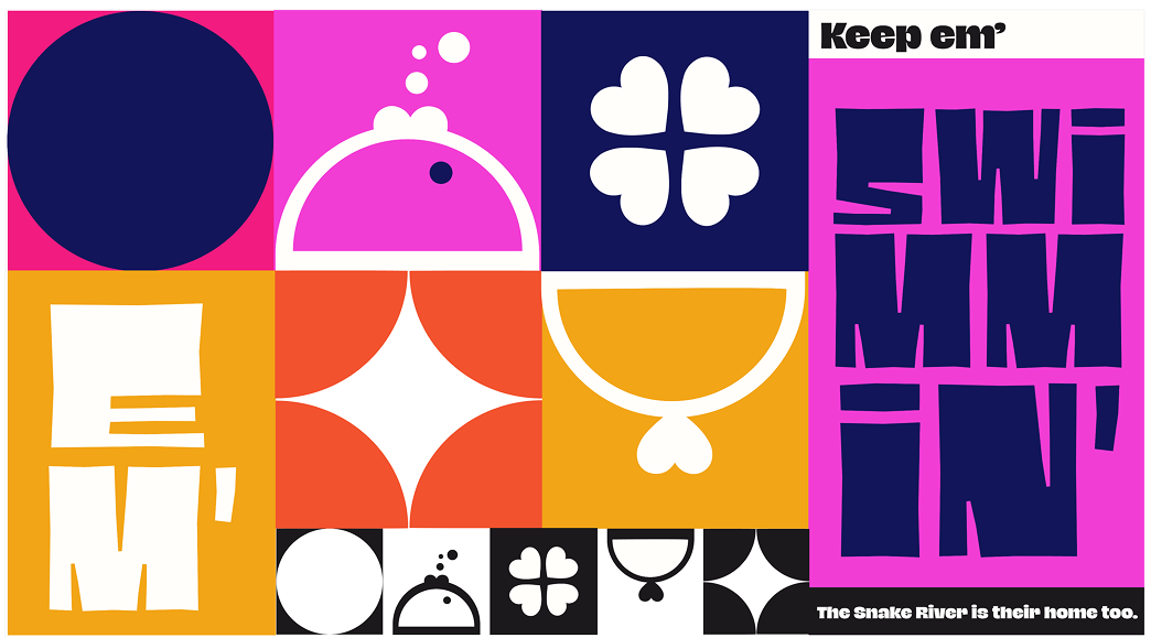
One strategy, four directions
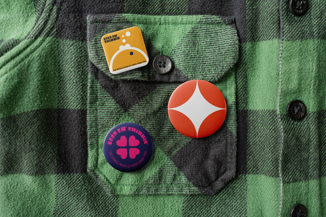
We all worked from the same hopeful approach, but each designer took it somewhere different. Teammates leaned into symbols, typography and Native-inspired motifs. I went for vibrant, rounded geometric shapes: soft, bold forms that feel friendly from a distance and reward a closer look.
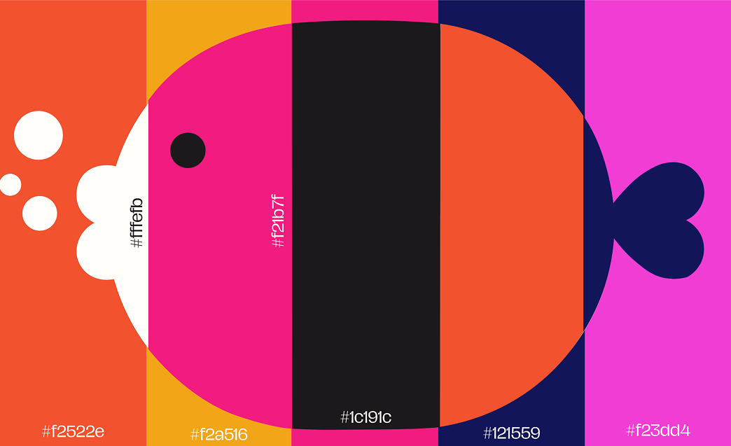
Colors borrowed from the salmon and the river
The palette is inspired by the salmon and the place they call home. Salmon (#F2522E), hot pink (#F21B7F), magenta (#F23DD4) and sun yellow (#F2A516) bring energy and personality. River navy (#121559) stands for the water that sustains local ecosystems. Black (#1C191C) and a soft off-white (#FFFEFB) create strong contrast while keeping the feel approachable.
Type with a friendly voice
Black Pack VF is the primary display typeface. Its bold, playful character grabs attention and gives the campaign a friendly personality. Hagrid handles supporting text and descriptions, adding contrast and keeping longer copy legible. Together they make environmental information feel engaging, welcoming and easy to understand.

The campaign in the world
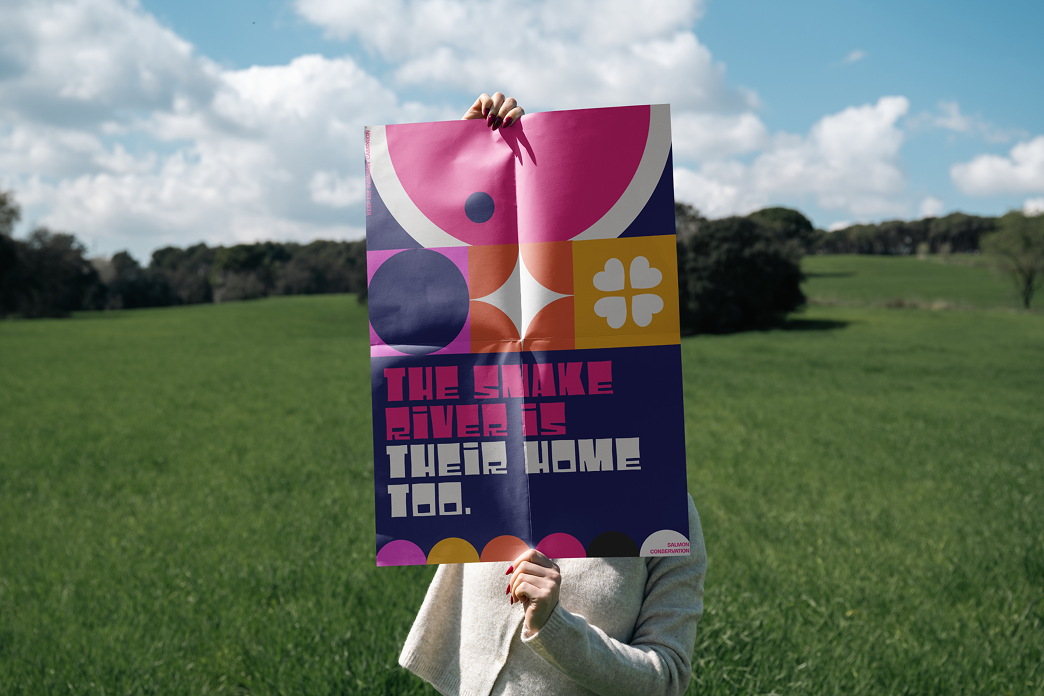
I carried the system into a set of posters and social media posts.
06 · The ending
Design as a tool for positive change
Although it was a fictional project, Keep Em' Swimmin' was one of the most rewarding I've worked on. My team and I communicated an environmental issue without relying on fear, and motivated our audience to care about the Palouse ecosystem through optimism and storytelling.
What I learned
- Design can educate. Visual design is a tool for positive change, not just decoration.
- Research has to become visuals. I learned to translate research into imagery that's both engaging and informative.
- Tone is a strategy. Choosing hope over fear shaped every decision, from shapes to color to type.
This project reinforced my belief that thoughtful design can make complex topics more accessible and inspire meaningful conversations.