Personal project · 2026
Mealmind
It's 6 p.m., everyone's hungry, and nobody knows what's for dinner.
A meal planning app that decides what's for dinner before you have to, designed in Figma and shipped as a live web app.
- My role
- UX/UI designer and front-end developer
- Timeline
- About 1 week
- Team
- Solo
- Tools
- Goodnotes, Sketch, Figma, Figma Make, React, TypeScript, Tailwind CSS, Vercel
01 · Setting the scene
Every night, the same question
Most households answer "what's for dinner?" at the last possible minute, standing in front of the fridge. Mealmind is a mobile meal planning app that answers it ahead of time. You browse recipes, drop them into your week, and get one combined grocery list for everything the plan needs.
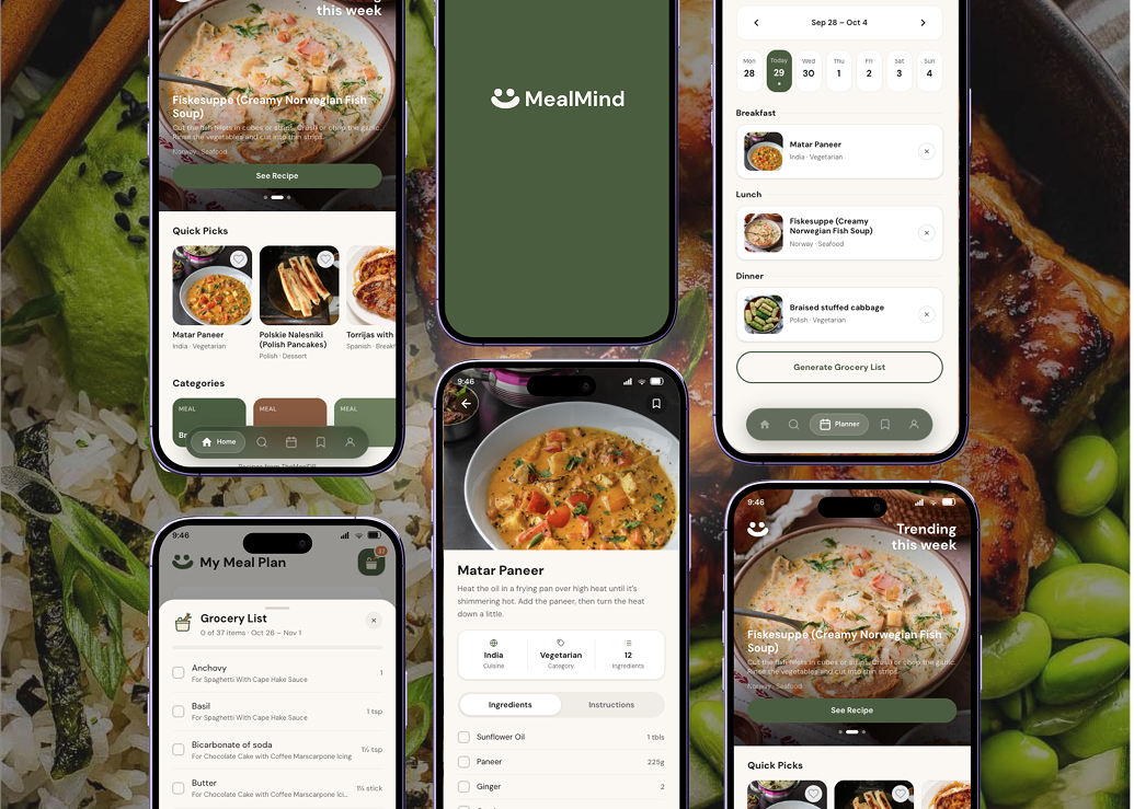
It was a personal project I took on alone, as both designer and developer, over about a week. I took it from paper sketches to high-fidelity Figma screens and a clickable prototype, then built it into a live React web app with real recipe data that anyone can try on their phone.
02 · The problem
Not deciding costs more than time
Skipping the plan doesn't just make evenings stressful. It shows up in the grocery bill and in the trash.
- 68% of married or partnered U.S. adults say deciding what to eat is their biggest mealtime challenge, and 44% struggle to come up with a dinner plan most nights. (Wakefield Research for Factor, 2024)
- $728 of purchased food is wasted per U.S. consumer each year, or $2,913 for a household of four. (U.S. EPA, 2025)
- 26% of U.S. households produce 38% of food waste, and that group plans meals ahead less often than average. (Li & Roe, 2024)
The daily decision is the hard part, and when nobody makes it, food and money go to waste.
03 · Digging in
What the numbers pointed to
Planning helps: 57% of adults plan meals at least occasionally, and planners eat a wider variety of food with better diet quality (Ducrot et al., 2017). But for most people planning is optional, so a planner only works if it feels lighter than not planning at all.
Each finding became a design goal:
- Deciding is the biggest challenge, so the app should suggest, not ask. There should always be a starting point.
- Planning is optional for many people, so planning has to be quick: a few taps, not a spreadsheet.
- Households that plan less waste more, so the plan has to connect to the shopping trip.
- Cooking happens every day, so the app should keep what works: saved recipes, plans and lists that are still there tomorrow.
04 · The turning point
A plan is only useful if it reaches the store
The breakthrough was realizing Mealmind isn't really a recipe app. Plenty of apps help you find a recipe. The real gap is between choosing meals and buying only what those meals need. That turned the brief into one question:
How might we help people decide what to eat before mealtime arrives, and buy only what their plan needs?
From then on, every screen had to move people along one path: get an idea, put it in the week, and walk out with a grocery list.
05 · Making it real
From notepad to live app
I moved through six stages, each at a higher fidelity than the last, so I only polished what had already worked in a rougher form.
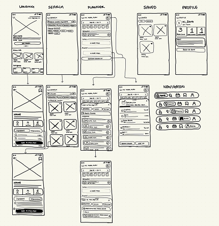
I sketched Home, the recipe page and the weekly planner on a notepad, trying several layouts quickly. This gave the app its basic structure early, so later stages refined layouts instead of rethinking what the app should do.
A wireframe that set the bones
I redrew the strongest layouts in Goodnotes to set real spacing and structure. Two choices made here lasted all the way to the final app: a photo-led Home with "Recipes we think you'd like," and a five-tab navigation bar (Home, Search, Planner, Saved, Profile).
A visual identity that made it feel like one product
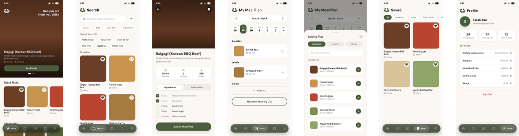
I wrote a prompt from that colored mockup for Figma Make to generate a first version, then rebuilt seven screens as editable Figma frames with auto layout, the olive-and-cream palette and DM Sans. I put the smiley logo beside every page title, so each tab shares the same header and the app reads as one product instead of separate pages.
A prototype that moved like the real thing
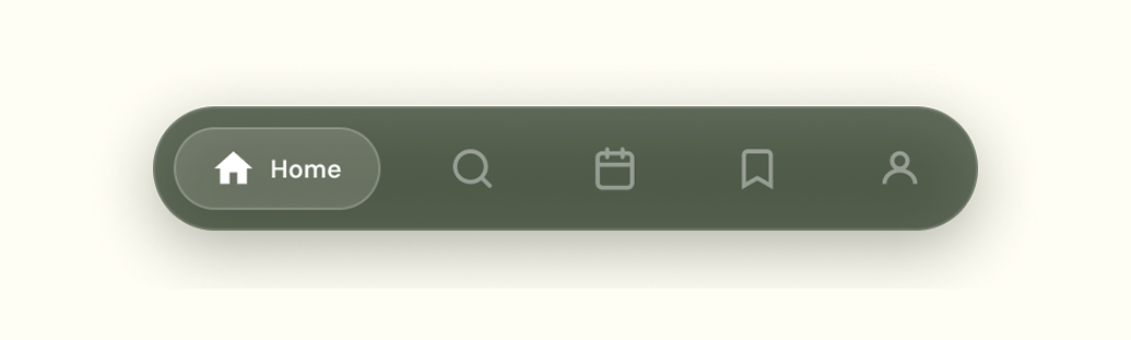
I linked 51 interactions so the main flow could be clicked through before any code existed: switching tabs, opening a recipe, and sliding up the Add Meal sheet to drop it into the planner. The nav highlight uses Smart Animate to glide to the new tab, so people always see where they are and where they came from.
Real data broke the mockups, and made the design better
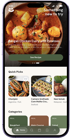
Building the live React app with real recipes exposed problems no mockup could. Ingredient data arrived messy ("6 servings avocado," wrapped units), so I redesigned the list with the name on the left and the amount on the right, one clean column that's easy to scan while cooking. Where the recipe source had no cook time or calories, I showed cuisine and category instead of inventing numbers. I pinned the status bar and nav so they stay in reach on long pages, and resized the Home tagline that was crowding the top of the screen.
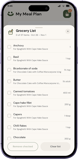
This is also where the feature that ties everything together came to life: the grocery list. One button turns the week's meals into a combined list, adding matching ingredients together ("Garlic, 5 cloves," with the recipes that need it). A friendly grocery bag button with a carrot carries a badge counting what's left to buy.
Under the hood
- Home loads a fresh set of recipes from the spoonacular API on every visit, with real cook times, servings and calories.
- The free API plan allows about 25 opens a day. When it runs out, the app switches to TheMealDB automatically, so nobody sees an empty screen.
- A small server function keeps the API key out of the public code, as spoonacular's terms require.
- Saved recipes, the meal plan, the grocery list and your name stay in the browser between visits.
- Every change deploys to Vercel from GitHub.
How I worked with AI
I used AI as a production partner. Figma Make generated a first version of the screens from my prompt, and I chose what to keep. Claude rebuilt the screens as editable Figma frames, wrote most of the React code and connected the recipe API, while I refined the layout, chose the API and directed every change. ChatGPT and Claude helped find statistics, and I dropped any number I couldn't verify against its original source.
The most valuable part was the feedback loop: I tested the live app on my phone, caught what AI missed, and directed each fix. It let me ship a working product in days, and taught me to treat AI output as a first draft that still needs a designer's eye.
06 · The ending
Dinner, decided
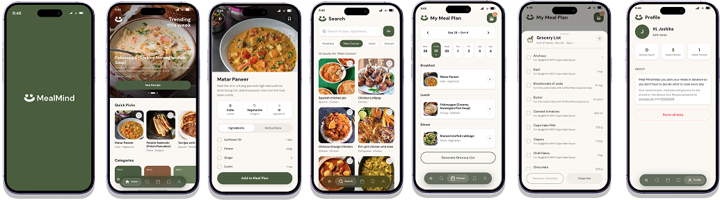
Mealmind went from a notepad sketch to a live app anyone can open on their phone. Open it and you get ideas right away. Tap a recipe into your week, and the grocery list writes itself.
What I learned
- Real data breaks tidy mockups. The API's ingredient lists needed a new layout and cleanup rules before they matched the design.
- Motion carries meaning. The sliding nav and pinned bars made the app feel native, not like a stack of pages.
- Design for failure. A backup recipe source and loading states keep the app usable when things go wrong.
What's next
- Usability testing with five people, then fixing the top issues
- Accounts, so plans sync between phone and laptop
- Dietary and allergy filters
- A grocery list sorted by store aisle
Sources
- Factor / Wakefield Research, via Business Wire (Jan 2025). 1,000 adults; sponsored by a meal company.
- U.S. EPA: Estimating the Cost of Food Waste to American Consumers (Apr 2025). Includes food wasted at home and when eating out.
- Li & Roe, Sustainable Production and Consumption (2024). 1,086 U.S. consumers.
- Ducrot et al., IJBNPA (2017). 40,554 French adults; an association, not proof of cause.
- Recipe data: spoonacular Food API and TheMealDB.